Examples
Common widgets
Here is a few examples of widgets use. First, there is the HTML using Startin’blox and then, the displayed result in a webpage.
All the values from <solid-display> are displayed with and without widget.
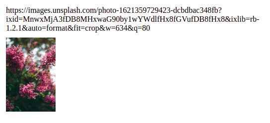
solid-display-img
<solid-display
   data-src="data/list/user-1.jsonld"
   fields="notimage, image"
   value-notimage="https://images.unsplash.com/photo-1621359729423-dcbdbac348fb?ixid=MnwxMjA3fDB8MHxwaG90by1wYWdlfHx8fGVufDB8fHx8&ixlib=rb-1.2.1&auto=format&fit=crop&w=634&q=80"
   value-image="https://images.unsplash.com/photo-1621359729423-dcbdbac348fb?ixid=MnwxMjA3fDB8MHxwaG90by1wYWdlfHx8fGVufDB8fHx8&ixlib=rb-1.2.1&auto=format&fit=crop&w=634&q=80"
   widget-image="solid-display-img"
   alt-image="pink flowers"
></solid-display>
solid-display-link
<solid-display
   data-src="data/list/user-1.jsonld"
   fields="notlink, link"
   value-notlink="https://startinblox.com/fr/"
   value-link="https://startinblox.com/fr/"
   widget-link="solid-display-link"
 ></solid-display>
solid-display-link-mailto
<solid-display
   data-src="data/list/user-5.jsonld"
   fields="email"
></solid-display>

<solid-display
   data-src="data/list/user-5.jsonld"
   fields="email"
   widget-email="solid-display-link-mailto"
></solid-display>
solid-display-value-date
<solid-display
   data-src="data/list/event-1.jsonld"
   fields="date"
></solid-display>

<solid-display
   data-src="data/list/event-1.jsonld"
   fields="date"
   widget-date="solid-display-value-date"
></solid-display>

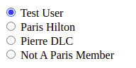
solid-form-radio
range attribute
<solid-form
   data-src="data/list/event-1.jsonld"
   fields="contact"
   widget-contact="solid-form-radio"
   range-contact="data/list/users.jsonld"
></solid-form>
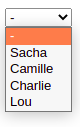
solid-form-dropdown
enum attribute
<solid-form
   data-src="data/list/event-1.jsonld"
   fields="personnes"
   widget-personnes="solid-form-dropdown"
   enum-personnes="Sacha, Camille, Charlie, Lou"
></solid-form>
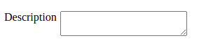
solid-form-textarea-label
<solid-form
   data-src="data/list/event-1.jsonld"
   fields="description"
   widget-description="solid-form-textarea-label"
></solid-form>
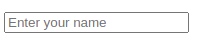
solid-form-text-placeholder
<solid-form
   data-src="./data/list/users.jsonld"
   fields="first_name"
   widget-first_name="solid-form-text-placeholder"
   placeholder-first_name="Enter your name"
></solid-form>
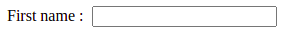
solid-form-text-label
<solid-form
   data-src="./data/list/users.jsonld"
   fields="first_name"
   widget-first_name="solid-form-text-label"
   label-first_name="First name :"
></solid-form>
solid-set-div
<solid-display
   data-src="data/list/users.jsonld"
   fields="name(first_name, ' - ' ,last_name, ' - ', username)"
   widget-name="solid-set-div"
></solid-display>
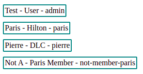
The border is applied on solid-set-div
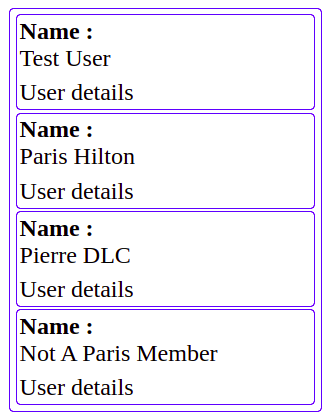
solid-action
A classic example of solid-action use is a list of resources (users here) with only one field displayed and the possibility to access additionnal informations by clicking on “User details” :
<solid-display
   data-src="data/list/users.jsonld"
   fields="name, details"
   value-details="User details"
   label-name="Name :"
   widget-name="solid-display-value-label"
></solid-display>
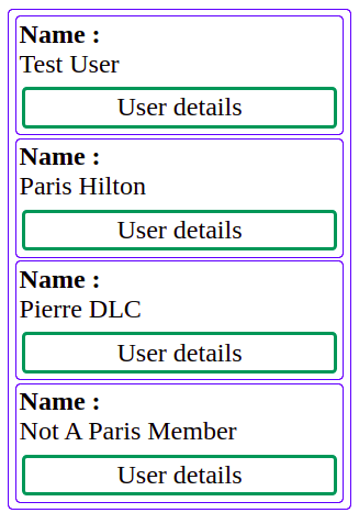
This is the solid-display with action attribute and link-text-[field] attribute use to replace the basic value-[field] from above.
<solid-display
   data-src="data/list/users.jsonld"
   fields="name, details"
   label-name="Name :"
   widget-name="solid-display-value-label"
   action-details="user-details"
   link-text-details="User details"
></solid-display>
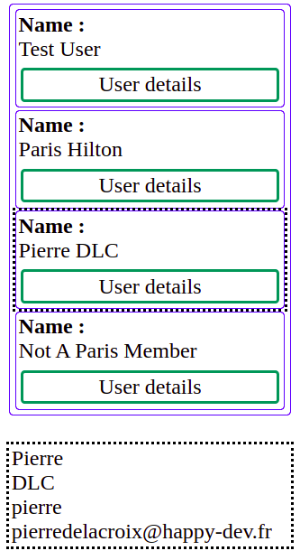
By adding a router, a route and another view, clicking on the solid-action displays the view (dotted border):
<solid-router use-hash>
   <solid-route
      hidden
      use-id
      name="user-details"
   ></solid-route>
</solid-router>

<solid-display
   data-src="data/list/users.jsonld"
   fields="name, details"
   label-name="Name :"
   widget-name="solid-display-value-label"
   action-details="user-details"
   link-text-details="User details"
></solid-display>

<div data-view="user-details" hidden>
   <solid-display
      bind-resources
      fields="first_name, last_name, username, email"
   ></solid-display>
</div>
Step-by-step widget creation
Create your widget
To display a field in a div tag, create your widget like this:
solid-: all the widgets of the core start withsolidkeyword
display-: to use the display directory of templates
div: to use thedivtemplate
Which gives us:
<solid-display
   bind-resource
   fields="name"
   widget-name="solid-display-div"
></solid-display>
This code generates:
<solid-display
   bind-resource
   fields="name"
   widget-name="solid-display-div"
>
   <!-- auto generated part -->
   <div>
      <solid-display-div name="name" value="John Doe">
         <div name="name">John Doe</div>
      </solid-display-div>
   </div>
   <!-- /auto generated part -->
</solid-display>
Add a feature
If you want to add a label, just add -label to your widget name
<solid-display
   bind-resource
   fields="name"
   widget-name="solid-display-div-label"
>
   <!-- auto generated part -->
   <div>
      <solid-display-div-label name="name" value="John Doe">
         <label>name</label>
         <div name="name">John Doe</div>
      </solid-display-div-label>
   </div>
   <!-- /auto generated part -->
</solid-display>
Mix keyword order
You can mix the order of the keywords, for the same result. For example, you can replace solid-display-div-label by solid-label-div-display:
Warning
Be careful because the generated widget will also have the name you give him. It can also have impact on CSS if you target widgets by their names.
<solid-display
   bind-resource
   fields="name"
   widget-name="solid-label-div-display"
>
   <!-- auto generated part -->
   <div>
      <solid-label-div-display name="name" value="John Doe">
         <label>name</label>
         <div name="name">John Doe</div>
      </solid-label-div-display>
   </div>
   <!-- /auto generated part -->
</solid-display>
Customize the label
To customize the label, you can set the label-name attribute on the solid-display
<solid-display
   bind-resource
   fields="name"
   widget-name="solid-label-div-display"
   label-name="User name:"
>
   <!-- auto generated part -->
   <div>
      <solid-label-div-display name="name" value="John Doe">
         <label>User name:</label>
         <div name="name">John Doe</div>
      </solid-label-div-display>
   </div>
   <!-- /auto generated part -->
</solid-display>
Handle multiples
In the case of a form, you may have to handle a field where you need to add or delete values. It can be done like this:
<solid-form
   bind-user
   fields="skills"
   multiple-skills
></solid-form>
As skills is a container, you will see each line as a text input, containing the id of the resource.
You will also have the ability to add or remove lines. The default multiple widget used is solid-form-multiple.
Add a dropdown
If you want to limit the selection of the skills to a list, add a range-skills attribute.
<solid-form
   bind-user
   fields="skills"
   multiple-skills
   range-skills="http://ldpserver/skills"
></solid-form>
Your text inputs will be replaced by dropdowns showing the available options.
Customize the multiple widget
If you need to have only one dropdown to select multiple values, you can change the multiple widget:
<solid-form
   bind-user
   fields="skills"
   multiple-skills="solid-form-multipleselect"
   range-skills="http://ldpserver/skills"
></solid-form>
Like for other widgets, you can choose to add features by adding them to the widget name. The following example will add a label before the widget, and initialize the SlimSelect plugin used for autocompletion.
<solid-form
   bind-user
   fields="skills"
   multiple-skills="solid-form-multipleselect-autocompletion-label"
   range-skills="http://ldpserver/skills"
></solid-form>