Widgets API Reference
Widgets are tools that allow to choose, precise how to display data.
They are created at the moment you ask for it for the first time. The name of the widget is analyzed to build a widget which uses the features and template you want.
Here is a schema of how it works:
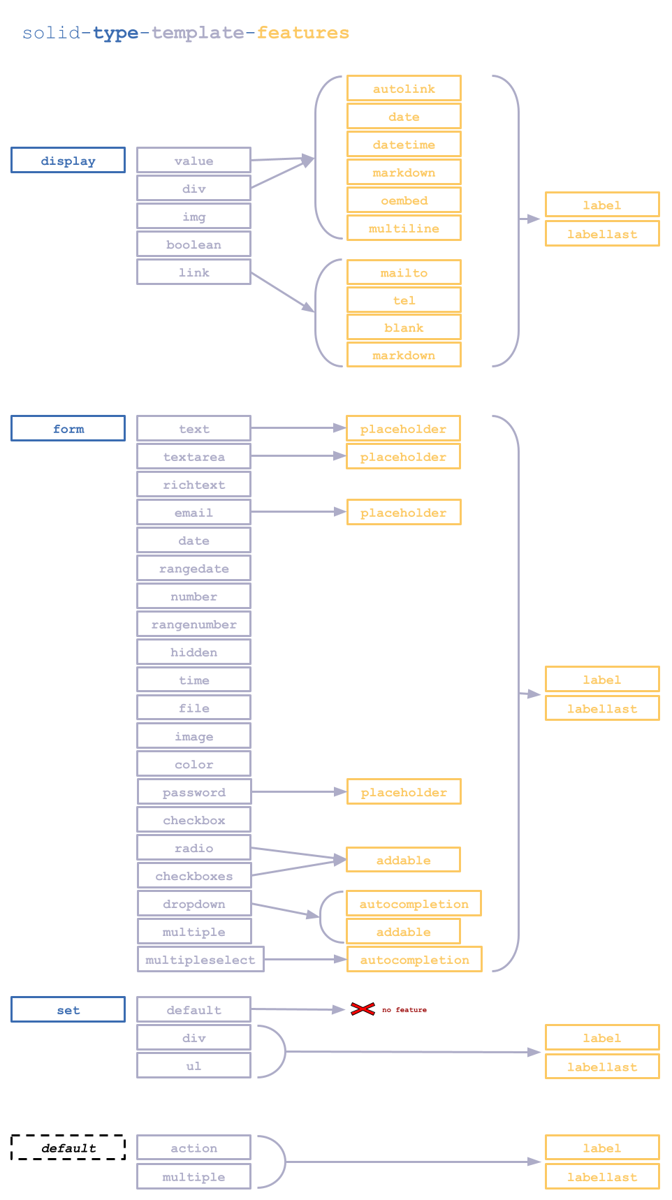
solid-[type]-[template]-[features]
Its name must begin by “solid-”, followed by at least a type (except for default type) and a template, and eventually one or several features.
All the keywords must be separated by an hyphen``-``, it is recommended to keep that order (to harmonise widget names writing).
type
It refers to the “kind” of data to display :
displayrefers to a display formatting,formto display a form element (<input>,<textarea>,<select>, etc),setto precise how to display values of fields in sets.
It will select the directory of template to use.
template
Name of the template to use.
Each type has several templates. They specify how to use or display the value(s) and/or to indicate the HTML tag to use.
Available templates :
displaydirectoryvalue: displaysvaluedirectly in the widget tag.div: displaysvalueinside a<div>tag.link: displaysvalueas anhrefattribute in a<a>tag.img: displaysvalueas asrcattribute in a<img>tag.boolean: displays label (or name) in a<label>tag ifvalue == true.
formdirectorytext: setvaluein an<input>of typetext.textarea: setvaluein a<textarea>.richtext: setvaluein an<div>and initialize a light rich text editor by usingQuill.checkbox: create a checkbox, which is checked ifvalue == true.email: setvaluein an<input>of typeemail.date: setvaluein an<input>of typedate.rangedate: set 2 values in 2<input>of typedate. Used for filtering with min and max. Possible to addstart-value-[field]andend-value-[field]attributes to set min and max values. Date format to follow : “YYYY-MM-DD”. Each attribute acceptstodayas value.number: setvaluein an<input>of typenumber.rangenumber: set 2 values in 2<input>of typenumber. Used for filtering with min and max. Possible to addstart-value-[field]andend-value-[field]attributes to set min and max values.hidden: setvaluein an<input>of typehidden. If you need to use a boolean or numeric value you can add aboolornummixin (ie:solid-form-hidden-bool).dropdown: setvaluein a<select>. The list is provided via therangeattribute, which expects a container’s URL, or via theenumattribute, which takes a list of the values separated by commas.radio: setvaluein a list of radio buttons. The list is provided via therangeattribute, which expects a container’s URL, or via theenumattribute, which takes a list of the values separated by commas.multiple: Accept a container URI as avalue, and inserts one widget per resource with a “remove” button for each widget, and an “add” button.multipleselect: Accept a container URI as avalue, and inserts a dropdown widget with themultipleattribute.checkboxes: Accept a container URI as avalue, allow to select multiple values with in a list of checkbox inputs. The list is provided via therangeattribute, which expects a container’s URL, or via theenumattribute, which takes a list of the values separated by commas.file: Inserts an<input/>and an<input type="file"/>. When a file is selected it’s uploaded, URL of file is returned by request and set as the<input/>value. The upload URL is provided via theupload-urlattribute.image: Works likefilebut allow only images in the input, and create a preview of the image when selected by the user.color: setvaluein an<input>of typecolor.password: setvaluein an<input>of typepassword.time: setvaluein an<input>of typetime. The format value ishh:mm.
setdefault: inserts widgets directly in the set tag.div: inserts widgets in a<div>tag.ul: inserts widgets in a<ul>tag.
default (no type keyword defined)
action: Displays a link inside a<solid-link>tag withsrcfor thedata-srcattribute,valuefor thenextattribute andlink-textas text content.multiple: insert asolid-displaywith the@idof a container asdata-src. The fields to display are chosen with themultiple-[field name]-fieldsattribute.
features
They allows to modify the behavior or the display of the widget. It is possible to add one or several features to the widget’s name :
label: adds alabelbefore the template. Uses the attributenameiflabelis not defined.labellast: adds alabelafter the template. Uses the attributenameiflabelis not defined.autocompletion: initializes theSlimSelectplugin. Works only withdropdownandmultipleselecttemplates.autolink: analyzes widget content, and transforms all links in anchor.mailto: addsmailto:at the beginning of anhrefattribute. Works only with links.tel: addstel:at the beginning of anhrefattribute. Works only with links.blank: adds an attributetarget="_blank". Works only with links.placeholder: adds a placeholder in the input. Uses the attributenameorlabelifplaceholderis not defined. Works only with input widgets.date: transforms the value in a date, in the browser’s default locale format.datetime: transforms the value in a date and time, in the browser’s default locale format.multiline: shows a value on multiple lines (replace\nby<br>).markdown: takes markdown code and displays formatted text. Works only with a display template (value, div, link).addable: adds a<solid-form>that allows to add data on the field concerned. It accepts attributes from solid-form by usingaddable-[field]-[attribute]="value"format. Ifaddable-data-srcis not provided, the solid-form will use the URI inrange-[field]as data-src, if declared.oembed: displays the video content of an oEmbed link filled with the associatedvalue-[field]attribute.