solid-form
The solid-form component serves dual purposes: editing existing resources and creating new resources within a container.
Editing a Resource
The solid-form component receives the URL of a resource via its data-src attribute and displays a form for editing the resource.
<solid-form data-src="http://example.com/resource/123/"></solid-form>
Creating a Resource
If provided with the URL of a container of resources, the solid-form component displays a form for creating a new resource and adding it to the container.
<solid-form data-src="http://example.com/container/"></solid-form>
Mixins
- This component uses the following mixins:
Please refer to their documentation for more details about their capabilities.
Specific attributes
autocomplete-[field]
Available from version 0.15
When set to
off, it disables the automatic entry of values in the specified[field]. This attribute can be added toinputs,textareaandselect.
autosave
Available from version 0.16
If this attribute is defined, each change in an input will trigger a request to update the resource. This attribute works only when editing resources, not creating them.
enum-[field]
Available from version 0.13
Specifies a list of values for the specified
[field]. These values must be be filled manually and separated by commas. This is particularly useful for dropdown or radio fields.
- Two formats are possible:
enum-[field]="value 1, value 2, value 3": each value will be displayedand loaded in value attribute
enum-[field]="value1 = a, value2 = b, value3 = c": each value will be displayedand “a”, “b”, “c” will be loaded in value attribute.
fields
Specifies the list of fields used to create the form. By default, all fields are used. More details can be found in the widget-mixin attributes section
label-[field]
When displaying a form, the default labels are the field names of the model. To customize a label, use this attribute, i.e.
label-username="Your name"
max-[field]
Specifies the maximum value for the specified
[field]. This attribute works only withsolid-form-numberandsolid-form-timewidgets.
maxlength-[field]
Available from version 0.16
Specifies the maximum number of characters that can be typed for the specified
[field]. This attribute works only withsolid-form-text,solid-form-emailorsolid-form-passwordandsolid-form-textareawidgets.
min-[field]
Specifies the minimum value for the specified
[field]. This attribute works only withsolid-form-numberandsolid-form-timewidgets.
minlength-[field]
Available from version 0.16
Specifies the minimum number of characters that can be typed for the specified
[field]. This attribute works only withsolid-form-text,solid-form-emailorsolid-form-passwordandsolid-form-textareawidgets.
naked
When set, this attribute removes the submit button. This is particularly useful to prevent the nested forms to display their own submit button.
order-asc-[field] or order-desc-[field]
Specifies the field used to order the range list
[field]. i.e.order-asc-users="username"
partial
Use this attribute when the form does not include all the fields of the resource that you want to update. This indicates that only the provided fields should be updated, leaving the unspecified fields unchanged.
pattern-[field]
Available from version 0.13
ASpecifies a regular expression to validate the input’s value for the specified
[field]. This attribute works only with asolid-form-textwidget.
range-[field]
Specifies the URL of a container that lists the accepted values for the specified
[field]. This is particularly useful with a dropdown field.
required-[field]
Makes the specified
[field]required by adding therequiredattribute to the input.
step-[field]
Available from version 0.16
- Specifies the stepping interval number for the specified
[field]based on themin-[field]value. This attribute works with:
solid-form-timewidget : The value is given in seconds (default value is 60).
solid-form-numberwidget : The default value is 1.
title-[field]
Available from version 0.13
Adds extra information about the specified
[field]. This attribute works only with asolid-form-textwidget.
upload-url-[field]
Specifies the URL to upload a file for the specified
[field]. This attribute automatically setswidget-[field]tosolid-form-fileif not defined. This is particularly useful with a dropdown field.
Mixin attributes
From next-mixin :
It can also be used to indicate the
nameattribute of the<solid-route>to reach after :
a click on a
<solid-delete>button (only after the resource is correctly deleted);a click on the submit button in a
<solid-form>(only after the resource is correctly saved).See the documentation of
<solid-router>for more details.
From store-mixin :
data-src
The uri of the LDP resource you want to fetch and use in the component.
Each time this attribute is changed, the data is fetched again.
When the data has been successfuly fetched, the mixin ask the component to render.
nested-field
The name of the field of the requested resource to display. Useful when the source url is auto-generated (for instance, with the attribute
bind-resources) but you need to display another field of this source.The example below illustrates how to use nested-field attribute :
The
profileis a resource nested in the current resource, it will automatically fetch thecity,phone,websitevalues to display them.The second solid-display shows another way to display the values from a nested resource with dot
..<solid-display data-src="data/list/user-1.jsonld" nested-field="profile" fields="city, phone, website" ></solid-display> <solid-display data-src="data/list/user-1.jsonld" fields="profile.city, profile.phone, profile.website" ></solid-display>
extra-context
The id of the
<script>tag which contains the context you want to add for this component. An extra context looks like this:<script id="custom-context" type="application/ld+json"> { "user": "https://api.test-paris.happy-dev.fr/users/" } </script>If your
<script>tag has the attributedata-default-context, this extra context will be applied on all the components which doesn’t have anextra-contextattribute.
loader-id
Id of the loader element you want to display during the loading time.
Exemple of use :
<section> <h1>Solid-form</h1> <div id="form-loader" > Loading… </div> <solid-form data-src="https://api.startinblox.com/users/" fields= "first_name, last_name, email" label-first_name = "First name" label-last_name = "Last name" label-email = "Email" loader-id = "form-loader"> </solid-form> </section>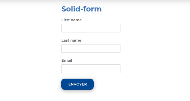
no-render
Available from version 0.13
While this attribute is present on a component, no data will be fetched. This attribute is automatically removed by the router when the component is in a view which has been activated. This allow to lazy-load components.
store:// attribute values
Available from version 0.13
This mixin decode all attribute values starting by
store://resource,store://containerorstore://userand replace them by the values fetched from the store.It can be a value fetched from the current resource or the current logged in user (works with
sib-auth).This example will create a text input filled with the username of the current user:
<solid-form
    data-src="https://api.startinblox.com/circles/"
    fields="user"
    value-user="store://user.username"
></solid-form>
This example will write the name of the circle in the custom field:
<solid-display
    data-src="https://api.startinblox.com/circles/1/"
    fields="custom-field"
    value-custom-field="store://resource.name"
></solid-display>
From validation-mixin :
confirmation-type
It is a prerequisite and can take two options :
confirm: to access to a basic modal dialog.
dialog: to get a<dialog>more customizable.
confirmation-message
Message displayed in the modal dialog (
confirmordialogtype). The message by default is “Please, confirm your choice” in English, “Merci de confirmer votre choix” in French.
The attributes below only concern ``dialog`` type.
confirmation-submit-text
Text displayed on the submit button (by default, “Ok” in English, “Oui” in French).
confirmation-cancel-text
Text displayed on the cancel button (by default “Cancel” in English, “Annuler” in French).
confirmation-submit-class
Submit button class name (undefined by default).
confirmation-cancel-class
Cancel button class name (undefined by default).
Some examples of the use of validation mixin attributes :
<solid-delete
    data-src="http://server/user/"
    confirmation-type="confirm"
    confirmation-message="Thank you to confirm the data deletion."
></solid-delete>

<solid-form
    data-src="../data/list/events.jsonld"
    confirmation-type="dialog"
    confirmation-message="Are you sure you want to create this event ?"
    confirmation-submit-text="Yes, I am"
    confirmation-submit-class="submit-button"
    confirmation-cancel-class="cancel-button"
></solid-form>
confirmation-widget
Available from version 0.17
Allows to insert a widget in the modal dialog, instead of
confirmation-message(confirmation-widget prevails over confirmation-message). The widget can contain a<solid-display>to display data from the resource concerned.Example of confirmation-widget attribute use :
<solid-widget name="confirm-delete-widget">
    <template>
        <div>
            <p>Are you sure to delete <strong><solid-display fields="name" data-src="${value}" style="display:inline-block"></solid-display></strong> ? </p>
        </div>
    </template>
></solid-widget>

<solid-delete
    data-src="http://server/user/"
    confirmation-type="dialog"
    confirmation-widget="confirm-delete-widget"
></solid-delete>
From widget-mixin :
fields
The ordered list of fields to be displayed, separated by commas.
By default, all the fields of the resource are used.
To not show any fields, put an empty fields (eg.
<solid-display fields />).By default, all displayed fields are inserted into a
<div>.It is possible to use the dot
.to display data from a nested resource.Sets
To group fields within a
<div>tag, enclose some fields in parenthesis.In this example, a
<div name="fullName">will be created, and it will contain the widgets of the first name and the last name of the user.<solid-display data-src="http://server/users/1/" fields="fullName(first_name, last_name), email" ></solid-display>Make sure you don’t give your set the same name as a field as it would result in an infinite loop.
You can customize the group widget, see the Sets widgets page for more info.
Strings
To display static strings in the fields list, put it inside quotes.
<solid-display
    data-src="http://server/users/1/"
    fields=" 'Email: ', email "
></solid-display>
It will create a
<span>element filled with the text ``Email: ``.
value-[field]
To display a string not contained within the data.
<solid-display
    fields="title"
    value-title="My custom and static title"
></solid-display>
default-[field]
Value displayed for
[field]when it’s empty or not defined.
widget-[field]
The widget to be used to display the
[field]. This widget can be:
A core widget. More informations on the widget reference page.
A custom widget. More informations on the solid-widget page.
A native HTML tag (ie:
h1). The value will be inserted as text content of the tag.
default-widget
The widget to use for all the fields, except if a specific one is defined for a field.
default-widget-[field]
The widget displayed by default if the
[field]is empty.
action-[field]
Displays a link with a
<solid-link>tag with the current resource asdata-srcand the value of the attribute asnext.
link-text-[field]
Works only with solid-display-link(-mailto/tel/blank) and solid-action Available from version 0.18
Modify the displayed value as link in :
<a>for solid-display-link,
<solid-link>in solid-action.
src-[field]
Defines the
data-srcin the solid-link created by theaction-[field]attribute.
label-[field]
Set the label for the
[field].
placeholder-[field]
Set the placeholder for the
[field].
class-[field]
Set the class applied to the widget of the
[field]or the set.
editable-[field]
Works only with display widgets
Add an “edit” button next to the
[field]to let the user edit it. The changes are saved as soon as the field loses focus.The editable attribute works with the following templates:
display-div
display-link<solid-display data-src="http://server/users/1/" fields="name" widget-name="solid-display-div" editable-name ></solid-display>
alt-[field]
Works only with solid-display-img
Set the alt for the field
[field].
empty-[set]
Available from version 0.17
Name of the widget to display when all the fields in
[set]are empty.
empty-[set]-value
Available from version 0.17
Value to pass to the empty widget if all fields in
[set]are empty. It is accessible in${value}<solid-display data-src="http://server/users/" fields="fullname(first_name, last_name)" empty-fullname="no-name-widget" empty-fullname-value="add-name" ></solid-display> <solid-widget name="no-name-widget"> <template> <small>No fullname filled in. <solid-link next="${value}">click here to add one</solid-link></small> </template> </solid-widget>
multiple-[field]
Allows to display the container
[field]nested in the current resource.It takes a container URI as a value, fetch all the resources of this container and display them.
Multiple widget can be specified, example:
multiple-skills="my-custom-multiple-widget". If argument is used without value, default multiple widget is used.It can be used in :
solid-display: a nestedsolid-displaywill be created with the container URI as data-src.All attributes of the form
multiple-[field]-[attribute]are transfered on the nestedsolid-displayas[attribute]. For example, to choose the fields you want to display, you can set:multiple-[field]-fields="name, @id"<solid-display data-src="http://server/users/1/" fields="skills" multiple-skills multiple-skills-fields="name" ></solid-display>
solid-form: all the resources of the container are displayed in a text widget.Buttons are automatically created to add and remove elements.
For
solid-formonly :
multiple-[field]-add-label: Text of the “+” button used to add an elementmultiple-[field]-remove-label: Text of the “x” button used to remove an element
Available from version 0.18
multiple-[field]-add-class: Class of the “+” button used to add an elementmultiple-[field]-remove-class: Class of the “x” button used to remove an element
Widgets
By default, the widget used is <solid-form-label-text>. Cf the
Widget page for more info.
Events
formChange
Triggered when the form values change
save
Triggered when the response of the submit has been received successfully