solid-table
Available from version 0.16
Receives the URL of a resource or of a container of resources via its
data-src attribute, and displays it in a table. Each resource is a line (<tr>)
and each field is a cell (<td>).
Like for the solid-display, custom widgets can be specified for each
field. Filters and searching capabilities can be easily
added to interact with the list of data being displayed.
<solid-table
   data-src="https://server/users/"
   fields="first_name, last_name"
></solid-table>
Mixins
- This component uses the following mixins:
Please check their documentation to know more about their capabilities.
Specific attributes
fields
List of fields displayed in the table.
More details on its use below (in widget-mixin attributes).
header
If defined, adds a header line at the top of the table. You can customize each header by setting a
label-[field]attribute.
selectable
If defined, adds checkboxes at the beginning of each line. If the
headerattribute is defined, a checkbox will also be added to the headline to select/unselect all the lines.You have access to the selected lines in Javascript, like this:
document.querySelector('solid-table').component.selectedLines
// returns [ "resourceId1", "resourceId2" ]
editable-[field]
Makes a cell editable by creating a solid-form in the cell. This form will be saved automatically when a change is detected.
You can customize the attributes of the form by setting them like this:
<solid-table
   data-src="https://server/users/"
   fields="first_name"
   editable-first_name
   widget-first_name="solid-form-placeholder-text"
   placeholder-first_name="Your First Name"
></solid-table>
Mixin attributes
From counter-mixin :
tags, and the
countervariable to add the number.<solid-display data-src="http://server/users/" fields="username" counter-template="<strong>${counter} users here</strong>" ></solid-display>
From filter-mixin :
Target a
<solid-form-search>used to filter current list of resource.Example:
<solid-form-search
    id="my-filter"
    fields="email"
    label-email="search by email"
></solid-form-search>

<solid-display
    data-src="http://server/users"
    fields="username, last_name, email"
    filtered-by="my-filter"
></solid-display>
search-fields deprecated
The properties you want to use to filter the list of resources. You can add multiple fields, separated by a comma.
In this example, a
solid-formwith ausernameinput and a<solid-display data-src="http://server/users" fields="username, email, first_name, last_name" search-fields="username, email" ></solid-display>You can customize the generated
solid-formby adding an attribute which starts bysearch-. It will be automatically added to thesolid-form, without the prefixsearch-.
search-value-[field]: The default value of[field]
search-label-[field]: Set the label for[field]
search-widget-[field]: The form widget of[field]
search-range-[field]: The range of values of[field]…
From grouper-mixin :
In this example, the mixin will render one
<div>for each different date, and put the corresponding resources inside.<solid-display data-src=http://server/events/" fields="name, date" group-by="date" ></solid-display>When used with the pagination, each group is paginated.
You can also use the dot syntax to group by a nested resource. For example, set the
group-byattribute tonested_resource.name.
group-widget
Available from version 0.13 default:
solid-group-defaultThe name of the widget to use as a group widget. It takes the name of the group as a
valueand put content in adiv[data-content]. Here is an example of a custom group widget:<solid-widget name="custom-group"> <template> <h2>${value}</h2> <section data-content></section> </template> </solid-widget>
group-class
The name of the class to add on each group widget.
From highlighter-mixin :
In this example, all the users with a
first_nameequal topierrewill be at the beginning of the list.<solid-display data-src="http://server/users/" fields="first_name" highlight-first_name="pierre" ></solid-display>
From list-mixin :
empty-value
Value to pass to the empty widget if the list is empty. It is accessible in
${value}For example, it can be a route name, which allow to put a link in the widget.
<solid-display
    data-src="http://server/projects/"
    fields="name"
    empty-widget="no-project-widget"
    empty-value="add-project"
></solid-display>

<solid-widget name="no-project-widget">
    <template>
        <small>No project yet in the list. <solid-link next="${value}">click here to add one</solid-link></small>
    </template>
</solid-widget>
From paginate-mixin :
In this example, the list will show pages of 5 users.
<solid-display
    data-src=http://server/users/"
    fields="username"
    paginate-by="5"
></solid-display>
paginate-loop
If this attribute is present, when the user is on the last page, the “Next” button brings back to the first one. Also, when he is on the first page, the “Previous” button brings to the last page.
Is is particularly useful for creating a carousel.
<solid-display
    data-src=http://server/features/"
    fields="name, description"
    paginate-by="1"
    paginate-loop
></solid-display>
From required-mixin :
The attribute takes no value.
[field]represents the mandatory property of resources to be displayed.In this example, users must have email to be dislayed.
<solid-display
    data-src=http://server/users/"
    fields="username"
    required-email
></solid-display>
It is possible to combine this mixin twice,
required-uvwandrequired-[field].
From sorter-mixin :
To sort in ascending, use
order-asc. To sort descending, useorder-desc.In this example, the users list will be ordered alphabetically based on the username.
<solid-display
    data-src="http://server/users/"
    fields="username"
    order-asc="username"
></solid-display>
order-by-random
If the attribute is present, the list will be shuffled before being displayed
<solid-display
    data-src="http://server/users/"
    fields="username"
    order-by-random
></solid-display>
sorted-by
Available from version 0.16
Target a
<solid-form-search>used to provide several options for the user to sort current list of resource.The
fieldsattribute of<solid-form-search>must at least containfield.Fieldattribute contains the fields of the resource to be offered to the user for sorting the data.
Orderattribute allows you to propose 2 sorting orders: ascending (asc) and descending (desc). By default, the order is ascending.The
<solid-display>cannot combineorder-ascororder-descattribute ANDsorted-byattribute.example:
<solid-form-search
    id="my-sorter"
    fields="field, order"
    enum-field="username, email"
    enum-order="ascending order = asc, descending order = desc"
></solid-form-search>

<solid-display
    data-src="http://server/users"
    fields="username, last_name, email"
    sorted-by="my-sorter"
></solid-display>
From store-mixin :
data-src
The uri of the LDP resource you want to fetch and use in the component.
Each time this attribute is changed, the data is fetched again.
When the data has been successfuly fetched, the mixin ask the component to render.
nested-field
The name of the field of the requested resource to display. Useful when the source url is auto-generated (for instance, with the attribute
bind-resources) but you need to display another field of this source.The example below illustrates how to use nested-field attribute :
The
profileis a resource nested in the current resource, it will automatically fetch thecity,phone,websitevalues to display them.The second solid-display shows another way to display the values from a nested resource with dot
..<solid-display data-src="data/list/user-1.jsonld" nested-field="profile" fields="city, phone, website" ></solid-display> <solid-display data-src="data/list/user-1.jsonld" fields="profile.city, profile.phone, profile.website" ></solid-display>
extra-context
The id of the
<script>tag which contains the context you want to add for this component. An extra context looks like this:<script id="custom-context" type="application/ld+json"> { "user": "https://api.test-paris.happy-dev.fr/users/" } </script>If your
<script>tag has the attributedata-default-context, this extra context will be applied on all the components which doesn’t have anextra-contextattribute.
loader-id
Id of the loader element you want to display during the loading time.
Exemple of use :
<section> <h1>Solid-form</h1> <div id="form-loader" > Loading… </div> <solid-form data-src="https://api.startinblox.com/users/" fields= "first_name, last_name, email" label-first_name = "First name" label-last_name = "Last name" label-email = "Email" loader-id = "form-loader"> </solid-form> </section>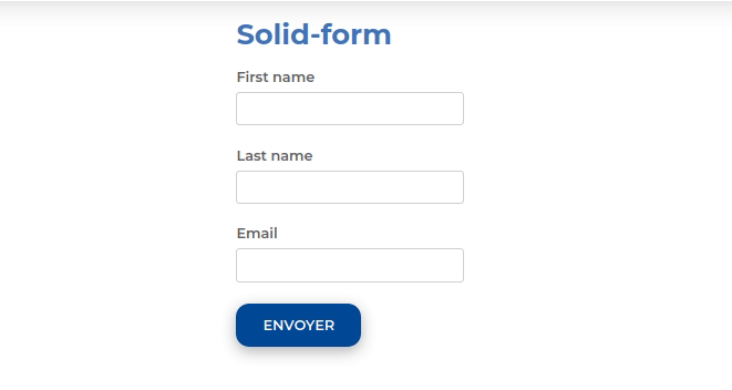
no-render
Available from version 0.13
While this attribute is present on a component, no data will be fetched. This attribute is automatically removed by the router when the component is in a view which has been activated. This allow to lazy-load components.
store:// attribute values
Available from version 0.13
This mixin decode all attribute values starting by
store://resource,store://containerorstore://userand replace them by the values fetched from the store.It can be a value fetched from the current resource or the current logged in user (works with
sib-auth).This example will create a text input filled with the username of the current user:
<solid-form
    data-src="https://api.startinblox.com/circles/"
    fields="user"
    value-user="store://user.username"
></solid-form>
This example will write the name of the circle in the custom field:
<solid-display
    data-src="https://api.startinblox.com/circles/1/"
    fields="custom-field"
    value-custom-field="store://resource.name"
></solid-display>
From widget-mixin :
fields
The ordered list of fields to be displayed, separated by commas.
By default, all the fields of the resource are used.
To not show any fields, put an empty fields (eg.
<solid-display fields />).By default, all displayed fields are inserted into a
<div>.It is possible to use the dot
.to display data from a nested resource.Sets
To group fields within a
<div>tag, enclose some fields in parenthesis.In this example, a
<div name="fullName">will be created, and it will contain the widgets of the first name and the last name of the user.<solid-display data-src="http://server/users/1/" fields="fullName(first_name, last_name), email" ></solid-display>Make sure you don’t give your set the same name as a field as it would result in an infinite loop.
You can customize the group widget, see the Sets widgets page for more info.
Strings
To display static strings in the fields list, put it inside quotes.
<solid-display
    data-src="http://server/users/1/"
    fields=" 'Email: ', email "
></solid-display>
It will create a
<span>element filled with the text ``Email: ``.
value-[field]
To display a string not contained within the data.
<solid-display
    fields="title"
    value-title="My custom and static title"
></solid-display>
default-[field]
Value displayed for
[field]when it’s empty or not defined.
widget-[field]
The widget to be used to display the
[field]. This widget can be:
A core widget. More informations on the widget reference page.
A custom widget. More informations on the solid-widget page.
A native HTML tag (ie:
h1). The value will be inserted as text content of the tag.
default-widget
The widget to use for all the fields, except if a specific one is defined for a field.
default-widget-[field]
The widget displayed by default if the
[field]is empty.
action-[field]
Displays a link with a
<solid-link>tag with the current resource asdata-srcand the value of the attribute asnext.
link-text-[field]
Works only with solid-display-link(-mailto/tel/blank) and solid-action Available from version 0.18
Modify the displayed value as link in :
<a>for solid-display-link,
<solid-link>in solid-action.
src-[field]
Defines the
data-srcin the solid-link created by theaction-[field]attribute.
label-[field]
Set the label for the
[field].
placeholder-[field]
Set the placeholder for the
[field].
class-[field]
Set the class applied to the widget of the
[field]or the set.
editable-[field]
Works only with display widgets
Add an “edit” button next to the
[field]to let the user edit it. The changes are saved as soon as the field loses focus.The editable attribute works with the following templates:
display-div
display-link<solid-display data-src="http://server/users/1/" fields="name" widget-name="solid-display-div" editable-name ></solid-display>
alt-[field]
Works only with solid-display-img
Set the alt for the field
[field].
empty-[set]
Available from version 0.17
Name of the widget to display when all the fields in
[set]are empty.
empty-[set]-value
Available from version 0.17
Value to pass to the empty widget if all fields in
[set]are empty. It is accessible in${value}<solid-display data-src="http://server/users/" fields="fullname(first_name, last_name)" empty-fullname="no-name-widget" empty-fullname-value="add-name" ></solid-display> <solid-widget name="no-name-widget"> <template> <small>No fullname filled in. <solid-link next="${value}">click here to add one</solid-link></small> </template> </solid-widget>
multiple-[field]
Allows to display the container
[field]nested in the current resource.It takes a container URI as a value, fetch all the resources of this container and display them.
Multiple widget can be specified, example:
multiple-skills="my-custom-multiple-widget". If argument is used without value, default multiple widget is used.It can be used in :
solid-display: a nestedsolid-displaywill be created with the container URI as data-src.All attributes of the form
multiple-[field]-[attribute]are transfered on the nestedsolid-displayas[attribute]. For example, to choose the fields you want to display, you can set:multiple-[field]-fields="name, @id"<solid-display data-src="http://server/users/1/" fields="skills" multiple-skills multiple-skills-fields="name" ></solid-display>
solid-form: all the resources of the container are displayed in a text widget.Buttons are automatically created to add and remove elements.
For
solid-formonly :
multiple-[field]-add-label: Text of the “+” button used to add an elementmultiple-[field]-remove-label: Text of the “x” button used to remove an element
Available from version 0.18
multiple-[field]-add-class: Class of the “+” button used to add an elementmultiple-[field]-remove-class: Class of the “x” button used to remove an element
Widgets
By default, the widget used is <solid-display-value>. Cf the
Widget page for more info.